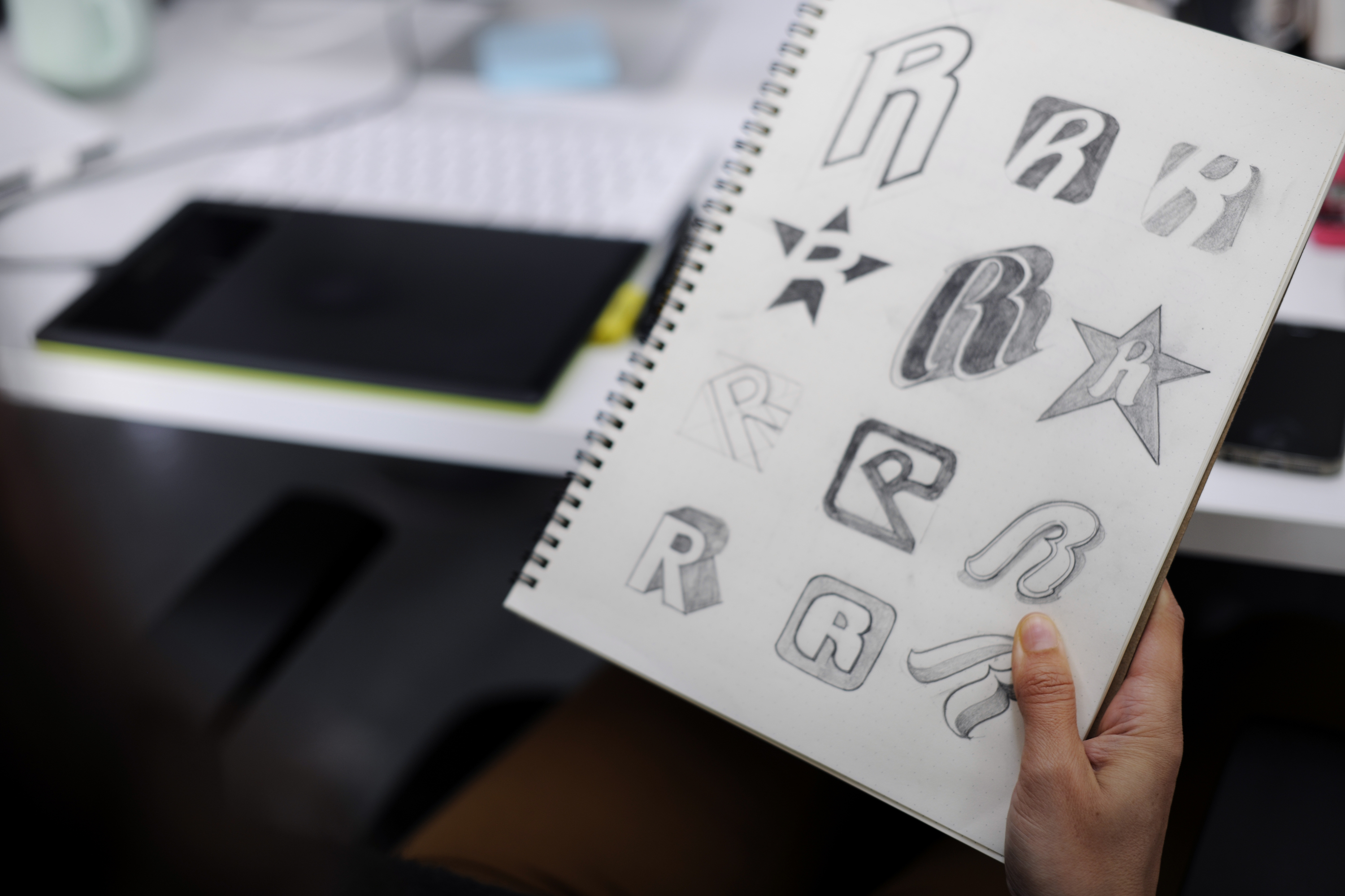
Why is logo design important?
While logo design is only one part of a company’s overall branding, it can become your most recognizable asset. Creating the perfect logo that matches your company branding and goals can be difficult and take time to craft. Balancing the right colors, choosing the perfect typeface, and avoiding what’s trendy will all help your logo stand out. It is important to remember what to avoid and what to strive for in a logo design.
What to avoid in logo design
Crafting a well designed logo can help build brand trust amongst consumers. If a potential customer sees your logo and feels that it looks poorly designed, the feeling towards your brand immediately decreases and builds mistrust in your company. Here are some things to avoid to prevent this from happening.
Minimize Color
It’s very easy to want to go “buck wild” with color in a logo, but oftentimes this can be distracting and become too much. A good rule of thumb is to stick to two colors and avoid using color gradients. Gradients can especially make a brand look tacky and outdated. The best way to design a logo is to start using only black. Typically, if a logo can be successful in all black, it will survive in color.
It is also a good idea to start only using black because logos are used in all sorts of places, including shirts, stickers, stationary, etc. Sometimes a single colored logo will stand out more on certain marketing materials and, not to mention, cheaper.
Poor Font Choice
Choosing your company’s typeface is an important task. Whether your logo is just a word mark or a symbol with your company name, font is a crucial part of its success. Avoid “silly” or childish fonts, such as, comic sans and marker style fonts. These style fonts can immediately take away from the legitimacy of your brand. They tend to look cheap and poorly considered. Choose a font that fits the style of your company. If your company has an overall luxury feel, maybe choose something neoclassical or serif. If your company is more modern and sleek, choose something sans serif or slab serif, but be careful not to blend in with overly generic typefaces as well. Classic is different than overused.
Scalability
Keep in mind how your logo will scale on different marketing materials. Watching out for how thin your lines get in your logo is key to its success. Having lines that are very thin will disappear when your logo becomes small. Using bold, thick lines allows for a logo to be readable at any scale. Also, choosing a typeface that can be easily read from a far or on a small scale is key.
Over Complicated Design
With logos, more is not always better. Most times there is a simple solution to represent your company. Using too many elements, colors, and words can over complicate your design and be overwhelming. It’s important to keep in mind that your logo does not need to say everything about your company, it only needs to be a symbol to represent you. Keep it simple. Choose 1-3 elements that are important to your brand and stray away from over-explaining with your logo.
Finishing Touches
Creating the perfect logo is difficult, but can be done. Avoiding these instant design fails can lead your logo to success and drive brand trust.

